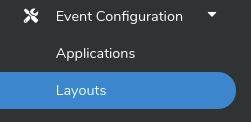
One of the first setup items you will need to do in order to start actively managing your market or expo is to create a Layout. A layout is the physical representation (ie. map) of your market or expo with all corresponding meta-data. In order to get started, click on Event Configuration -> Layouts in your side navbar as seen below.
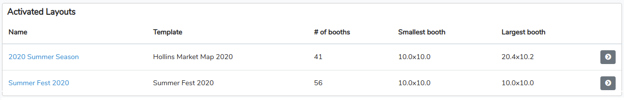
That will bring you to your Layouts section where you will see Activated Layouts and Layout Templates. An Activated Layout is one that has already been linked to a market or expo season, it is essentially a layout that is currently in use. A Layout Template is a layout that has been created and is available to be linked to a season (before that season is activated).
In the example shown below you can see we have two Activated Layouts. One for our 2020 Summer Season and one for our Summer Fest 2020.
NOTE: You can always update a layout after it is linked to a season and activated but make sure to select the Activated Layout when editing and not the Layout Template.
In this example we also have a couple of Layout Templates already created (including the two that were linked as Activated Layouts above).
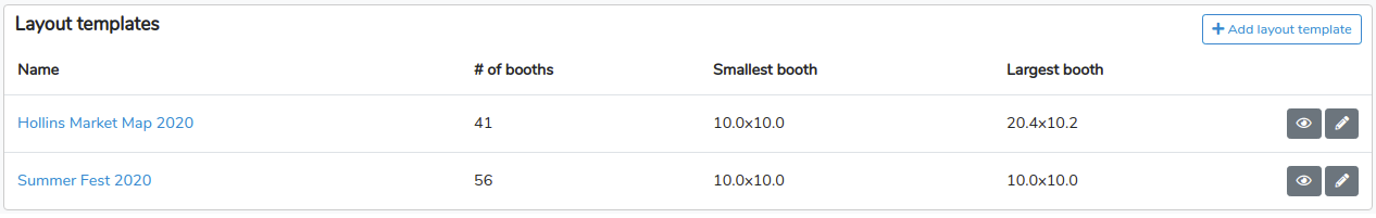
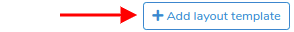
To create a new template click on the blue +Add layout template button to the right of the Layout Templates section header.
This will open the Layout Editor, an intuitive graphic grid based map layout tool (see example below). With our Layout Editor you can create basic layout maps or, get creative, and produce highly artisitic and sophisticated ones.
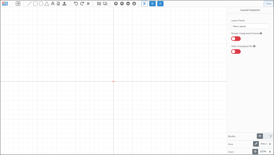
Now, to get started we will walk you through the basics below. First, lets look at the the global configurations available in the Layout Editor. These can be found in the lefthand Layout Inspector. This Inspector panel is viewable when no other map elements are selected.
General Layout Settings
Layout Name
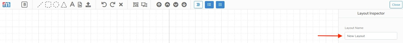
The first thing you should do when creating a layout is to name it. In the top left you will see the name of your layout, by default this will be "New Layout" (see image below).
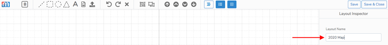
To change the name, simply click on current name and start typing. In the example below you can see we updated the name to "2020 Map".
Render Assigment Names
The Render options allows to set your Layout Maps to show vendors names by default. If this option is not enabled the default will be to show booth IDs by default.

Hide Unassigned IDs
The Hide Unassigned IDs allows you to configure you Layout Maps so that any unassigned booth IDs are not displayed.

Creating your Map
The Booth Element
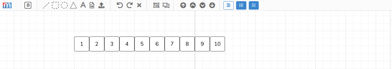
You can add a stall/booth to your layout by clicking the booth element at the far left side of your top toolbar. It's the square with the B in the middle (see image below).

In the example below you can see 10 new spaces were added by clicking the booth element 10 times.
Booth elements are special in that they are not just squares in your layout but contain metadata, important information associated with each space that describes the attributes of the booth and allows you to assign monetary values and schedule vendors/exhibitors to them.
Once you create some booths you can configure their attributes by clicking on them individually. For example, if we wanted to update the metadata for booth 2 we simple click on it to expose the Booth Inspector on the right. (see image below).
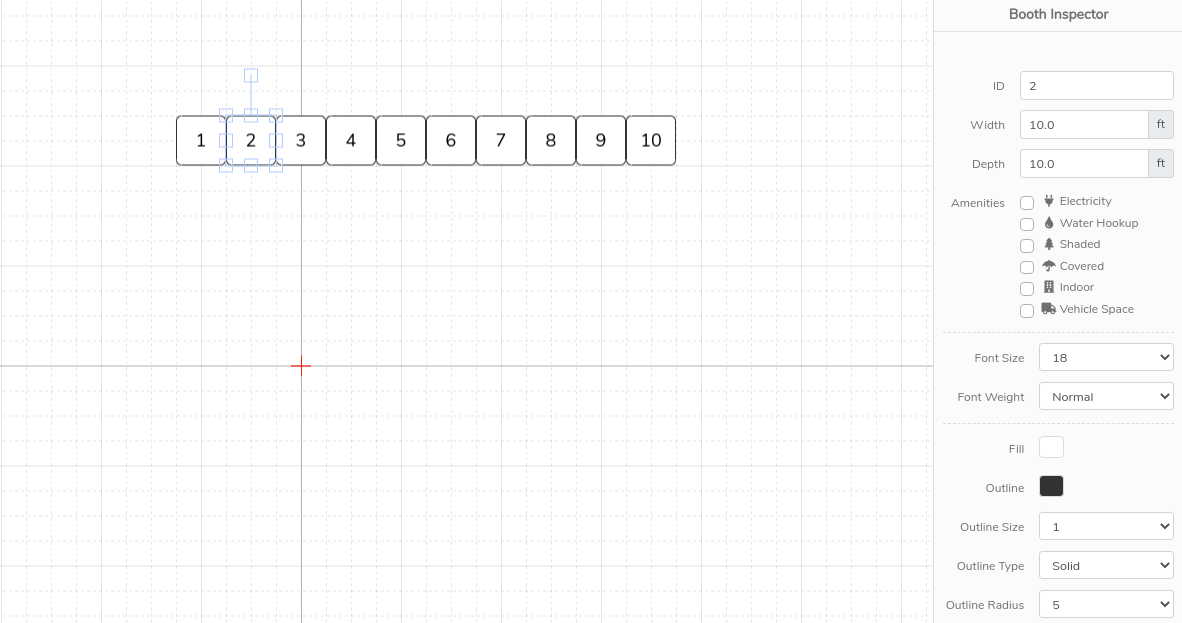
As you can see clicking on booth 2 opened up the Inspector widget on the righthand side of the editor. This Inspector is how you can update the space metadata. Below we go into each each metadata attribute available to configure.
- Booth ID
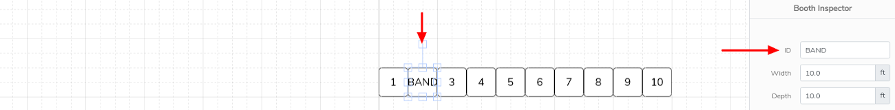
The Booth ID is used to name the space. By default these IDs are created with sequential numbers starting with the number 1. You can renumber them and even rename them with any combination of letters and numbers. As an example we renamed Booth ID "2" to "Music A" below.
- Space Size
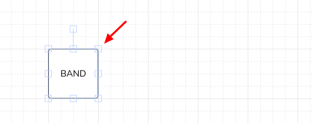
The Booth Size can be configured with the Width and Depth attributes. By default all booths are created as 10 x 10, the most common booth size. The size of the booth can updated by entering the width and depth for each space. In the example below we updated the "BAND" space to be a 20 x 20.
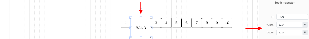
NOTE: The layout grid is to scale with each backgroud square representing 5 feet by 5 feet. As you can see the 20 x 20 "BAND" both above takes up 4 layout squares by 4 layout squares, (4 x 5 feet =20 feet).
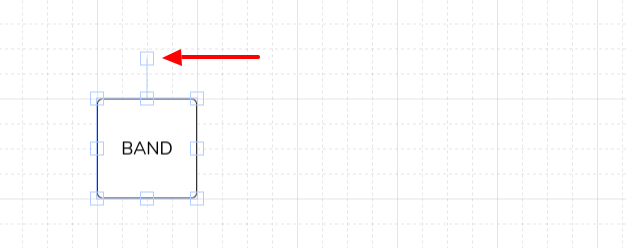
Booths can also be resized by simply selecting one of the small edit squares and dragging to size as seen below. This will auto-update the Width and Depth in the Inspector.
The orientation of the booths can also be adjusted by select the selection square connected to the booth by a line. Just grab it and turn the booth in any direction.
TIP: Hold down the Shift key while grabbing the selection square and rotate the booth at clean increments of 45 Degrees.
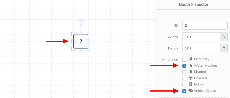
- Amenities
Layout Amenities are available to associate with individual booths. These amenities are advertised to vendors when you enable booth prefences in your season configuration. That way vendors can select them as prerferred booths when applyting to your market or expo. To assign amenities to a booth, select the booth by clicking on it. Then in the lefthand Inspector check all amenities checkboxes that apply (see example screenshot below).
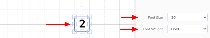
- Font Size & Weight
Font size and weight allow you to adjust the size of the font for the Booth ID as well as set it to normal or bold font. In the example below we set the font size to 36 and set it to be bold.
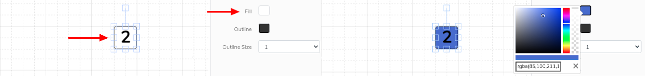
- Fill
Booths can be filled with custom colors by selecting the space and then clicking on the Fill color selector in the righthand Inspector (see example below).
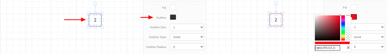
- Outline
Spaces can be have custom border colors by selecting the space and then clicking on the Outline color selector in the righthand Inspector (see example below).
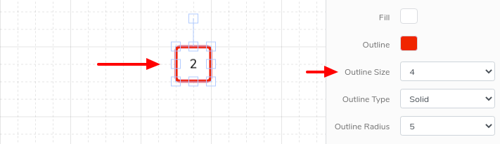
- Outline Size
Space border size can be adjusted by selecting the space then clicking on the Outline Size selector in the righthand Inspector (see example below).
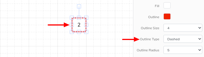
- Outline Type
Booth borders can be configured to be solid or dashed by selecting the space then clicking on the Outline Type selector in the righthand Inspector (see example below).
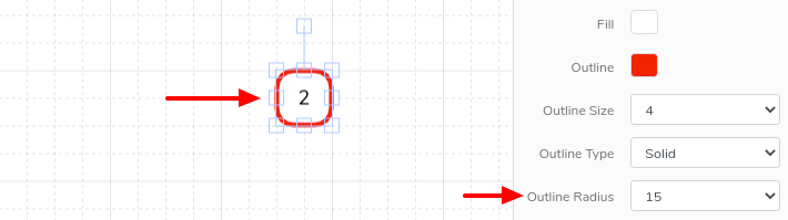
- Outline Radius
Booth borders can also be rounded to provide a softer or more circular appearance. The default is 5 which give a nice, subtle rounded edge.
Graphical Elements
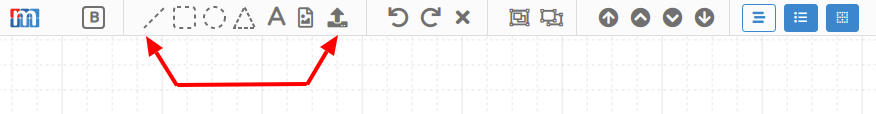
In additon to the special booth element, the Map Layout Editor also includes other graphical elements that can be added to build out a well designed layout map. These include the following:
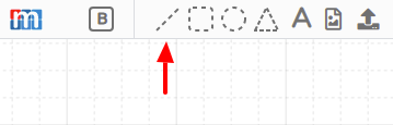
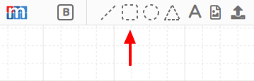
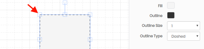
- Straight Line Element
Use the straightline element in the top toolbar to create lines in your map layout.
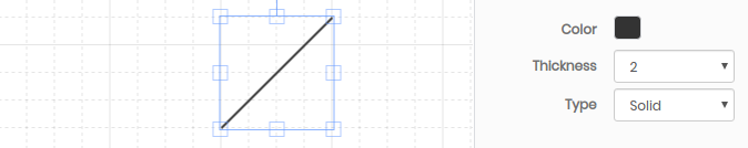
These lines can be configured to be any color and thickness as well as drawn as solid or dotted by updating the Color, Thickness and Type setting in the righthand Inspector.
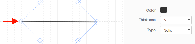
To rotate the line element, click on it, then grab the rotate control as shown below. Move it to the desired orientation.
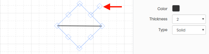
To enlarge the line element, click on it, then grab any of the 8 small squares as shown below. Use these to drag to the desired size.
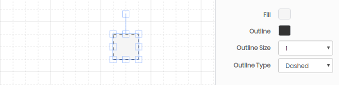
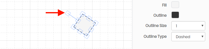
- Rectangle Element
Use the rectangle element in the top toolbar to create rectangles in your map layout.
The rectangles can be configured to be filled with any color and outlined with any color. The outline thickness can also be adjusted as well as drawn as solid or dotted by updating the Fill, Outline, Outline Size and Outline Type settings in the righthand Inspector.
To rotate
To enlarge
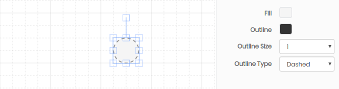
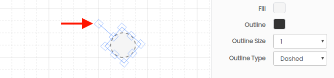
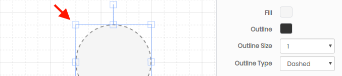
- Circle Element
Use the rectangle element in the top toolbar to create rectangles in your map layout.
The circles can be configured to be filled with any color and outlined with any color. The outline thickness can also be adjusted as well as drawn as solid or dotted by updating the Fill, Outline, Outline Size and Outline Type settings in the righthand Inspector.
To rotate
To enlarge
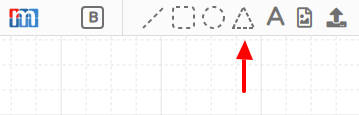
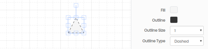
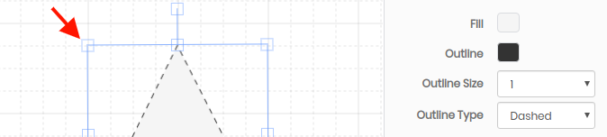
- Triangle Element
Use the triangle element in the top toolbar to create rectangles in your map layout.
The traingles can be configured to be filled with any color and outlined with any color. The outline thickness can also be adjusted as well as drawn as solid or dotted by updating the Fill, Outline, Outline Size and Outline Type settings in the righthand Inspector.
To rotate

To enlarge
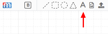
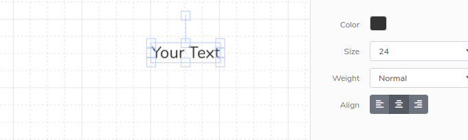
- Text Element
Use the text element to add text block elements.
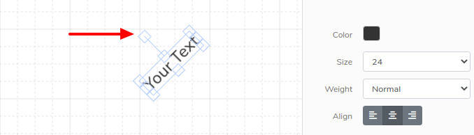
The text can be configured to be any color. The font can also be set to a number of Sizes, Weights and left, center and right Aligned with the Size, Weight and Align options in the Inspector.
To rotate
- Icon Elements
In addition to the standard geometric and text elements listed above the Map Designer also provides a number of other graphical elements including things like benches, restrooms, door, etc.
Use the additional element icon in the top toolbar to create rectangles in your map layout.
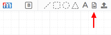
Select from the available elements.
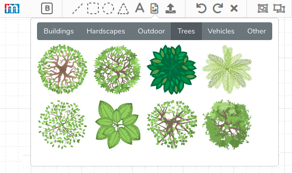
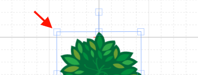
All additional elements can be moved and resized in the same way the standard geometric elements are. For example, selecting the tree element will add a tree to your canvas.
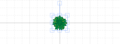
Additional elements can rotated just like other elements.
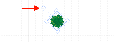
They can also be enlarged just like other elements.
Advanced External Elements
The Map Designer is not limited to the elements provided in the top toolbar. In fact, you can create your own elements and import them for use in the canvas. These can be simple elements, like the addition of a bush or they can be complex elements such as a custom background element with unique paths and other features.
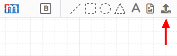
The one requirement for external elements is that they must be SVG (Scalable Vector Graphics). This is what allows maps to be zoomable and broken out into separate areas.
To add an External Element to the canvas use the external element on the top toolbar.
External elements can be rotated and enlarged just like any other element.
Precision control of elements
Locking elements to the Canvas
All elements in your layout can be locked to the canvas. Locking an element means that it cannot be moved or grabbed. This can be very useful when creating the base background for your map - those parts that you don't want to accidentally edit.
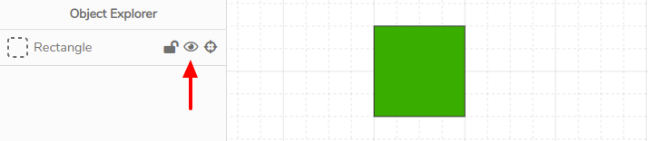
Locking of elements can be done from the Object Explorer by clicking on the button below.
For example, if you had three elements you can individually lock any of them in the Object Explorer as seen below. In this case we are locking the green Rectangle.
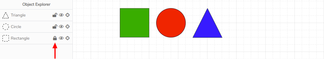
In the above scenario, with the green Rectangle locked, this is no way to grab or edit unless you unlock it via the Object Explorer.
Hiding elements to the Canvas
Elements can easily be hidden using the Object Explorer.
Clicking on the eye icon will hide the element from view.
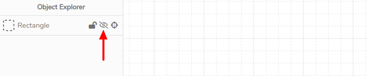
In this case, the element still exists but is not viewable on your canvas or published in your live map.
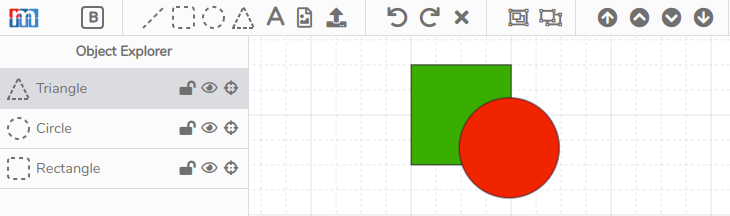
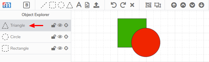
Sending elements forward and backward
Elements in your map can be layered in front or behind others by sending the forward or backward. This can be done in the Object Explorer with the Bring to Front and Send to Back buttons.
In the example below, we have two elements, one green square and red circle. As you can see the red circle sits on top of the green square.
To send the red circle to the back, click on the Send to Back button highlighted below.
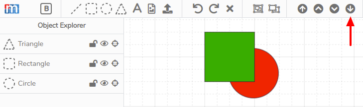
Also, notice sending the red square to the back caused it to be moved down in the Object Explorer element list. This list is ordered from top to bottom following the order the elements lay in the canvas.
Precise control of placing elements
Precise placement of elements, beyond what you can do by dragging them around, is possible by selecting an element while holding down the Ctrl key. With the Ctrl key held down you can use the keyboard arrows to move the elment 1 pixel at a time in any direction.
Similarly, if you grab an element while holding down the Shift key you can use the keyboard arrows to move the element 5 pixels (one small canvas square) at a time in any direction.
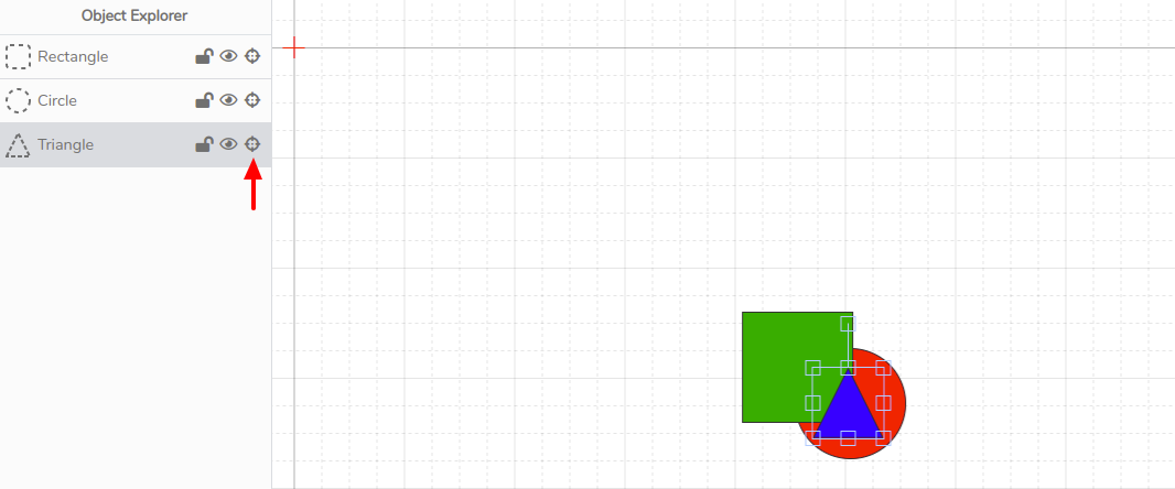
Finding element quickly
Elements can quickly be located on your canvas using the Object Explorer. In the example below we have a triangle element that is off the visible section of the canvas.
The triangle can be easily located but clicking on the center icon on the triangle element line. In the example below the zoom level was increased to show you the original view and the located triangle which was off screen.
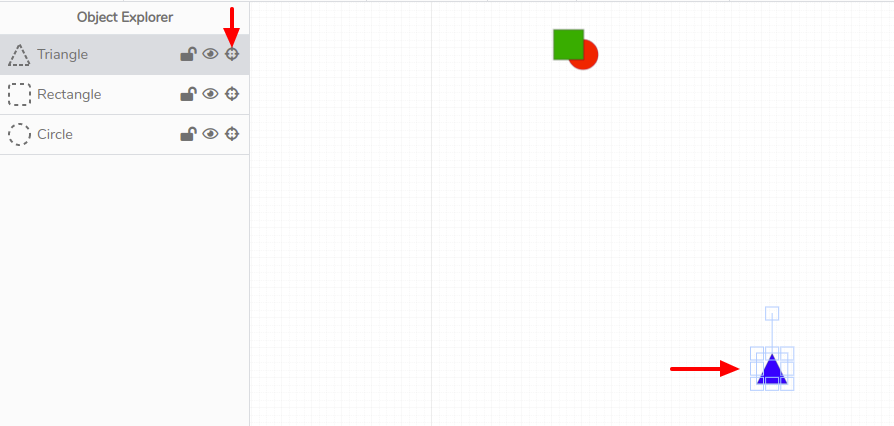
Another great use of this feature is to find elements that might be buried under other elements, out of view. In the example below the bue triangle is actually under the other two elements.
Again, clicking on the center icon we can quickly find the blue triangle element.